Sunday, 4 December 2011

A Change Of Heart

For our second area induction project we were set a brief about Old English Idioms. We were asked to chose an idiom and interpret it in a new, innovative and visual way for a contemporary audience. The images we created also had to take the format of a square. After careful consideration, I narrowed down my choice of idiom to the following:
  • A leopard can never change its spots
  • To take a stroll down memory lane
  • To have a change of heart

Mindmap
I wanted to illustrate these idioms with the first image that I associated them with


Initial sample deisgns/compositions


I decided to work with the idiom 'Have a change of heart' because I could apply this in a wide variety of contexts. For my project I focused on three possible interpretations of this idiom: I explored its meaning in the context of literally having a change of heart and linked this to the topic of Heart Transplants and Organ Donation; I looked at the damaging effects of smoking on the heart and what problems this could cause; and finally an emotional change of heart about a person, subject, item or placee- these types of articles are usually found as editorial in magazines and are often structured as 'Agony Aunt Advice Collums'; my aim was therefore to create images to represent these three contextual environments in which my idiom could be explored.

Stitching

For my 'Agony Aunt Editorial' image I decided to stitch into drawings and paintings of the human heart that I had done, I thought the stitches themselves could represent medical stitches that a person has aftter cutting a certain part of their hand for example, too deeply, I specifically chose blue, red and black coloured thread to represent arteries, veins and capillaries that carry the blood from the heart around the various parts of the body.


This is an example of one of my stitched Hearts, the fibrous threads dangling from the centre create quite a nice effect in the sense that the Heart looks as it has connections which spam across each and every part of it to the body.

Projection Photography
I transferred drawings and paitnings of the human heart that I had done onto acetate and projected these onto the bodies and faces of my models. I organised three seperate photoshoots to represent each of the contexts that I was exploring and placing my idiom in.

Agony Aunt Editorial Development pieces and Ideas


'Kill Smoking'

This was the second context that I was placing my idiom in- Raising awareness of how bad smoking is for the heart by projecting a painting of a human heart onto the bare back of my model- the idea behind this was to envoke interest and awareness at the fact that smoking damages the heart. The main concept however elludes to the fact that smoking can lead to heart damage and ultimatly heart failure- the heart would therefore need a literal 'change'.


Heart Transplant


Saturday, 26 November 2011

Site and Scale Project

This project was an extension of my 'alternative image making project' in the sense that I took my object- which was a key and was asked to re-create it on a much larger (or smaller scale) I decided to enlarge the object because it was a relatively small object to begin with. We were asked to translate our image onto a particular site and to experiment with scale in the process.

The site could be anything! below are a few examples of what I had in mind:

  • urban

  • rural

  • a domestic setting e.g. kitchen

  • park

  • building

  • farm

  • street

  • pond

  • garage


  • Drawing with thread

    This is the first site and scale image that I created, I used lots of colourful threads to fill in the space that I had created by outlining the shape of a large key in a thick white string- I called this technique 'drawing with thread' because that's exactly what I'm doing, I was using the string as my drawing implement and used masking tape to keep the string in place, This is part one of four of my site and scale project images. I really enjoyed creating a temporary, non-studio based piece of work.


    'Flour power'

    The second site and scale image was created outside on the street. I created a large cut-out of my key and placed it on the ground. I then sprinkled flour on top of the cut-out, until it was more or less covered with flour- I then slowly removed the cut-out and was left with a beautiful image of my object.


    'Metal Mania'

    For the third image of my site and scale project I created a large scale outline of my key, from small metal objects such as nails and other keys. This was again done outside on the street and worked quite well. If I was to improve this image I would have nailed/ attached the metal pieces to a background- such as a large piece of wood and then photographed it upright. Nevertheless, I really liked the way the image looked photographed.


    'Lighting the Night'

    For the fourth and final image of my site and scale project I created a large outline of a key using tea light candles, this was an obvious choice because I had already experimented with imprinting the shape of my key into large dense candles. My alternative image making project was experimental of heat and burning techniques and so I thought the tea light candles would create interesting synergy and meaning. This was the most difficult piece to pull off because it happened to be a windy night when I was creating my image and some of the candles had been blown out before I could photograph. Although I had some trouble in trying to light all the candles, it was fun trying to! I have really enjoyed creating these temporary non-studio based images- It taught me to be more expressive and out-going with my work and was a completely new experience and challenge.

    I intend to add to this project over the next few months, trying out new techniques and experimenting with obscure and interesting ways of creating the image of my key.


    Friday, 25 November 2011

    Studio space nameplate

    Since we're now working in our specialist areas- (Fine Art, Fashion&Textiles, 3D and Graphics) our studio spaces are continuously transforming and changing, it is also unclear as to what area people are working in (to someone who is unfamiliar with the general layout of the space) and so the Graphics tutors asked us to create a 'nameplate'- this had to be A5 and also had to have the following information on it:
    • your name
    • specialist area
    • Inspirational designer
    • a book that you were reading
    My nameplate


    I created this image by employing both hand-made and computer based techniques; I firstly used inks and 'brusho' to create vibrant and interesting backgrounds and colour combinations and scanned these, I then allowed purple thread to fall into different shapes, before scanning in the various twists and patterns that it made; I then blended these layers with a photograph of me from earlier on this year and experimented with the different layering options on Photoshop. I  scanned in the floral pattern which I had had-drawn and added the text which I had edited in illustrator. After carefully layering and blending my material, this is what I created.

    Saturday, 19 November 2011

    Specialist Area Project- The Big Issue

    This was the first project we undertook in our specialist areas, no surprises that I'm in the Graphics area now. This first project- The Big Issue- is about issues that frustrate, anger, or irritate us as individuals and so it's personal to each and every one of us. The issue that angered me the most was war and how the media have desensitized us towards violence and horrific imagery. My project is thought- provoking and challenges the ideology behind war. I Particularly focused on the Iraq War, since the US invaded in March 2003, there has been a declining interest for the welfare of the civilians there; we hear about and see footage of blasts and explosions and read about the death tolls but soon forget about it all and move on with our own lives.

    This is what I was interested it- the point where we switch off and stop caring- so I wanted to
     re-ignite that anger and sense of appal at the state in which that country is. There are still people suffering everyday, mourning the loss of family members and worrying whether they'll make it out alive tomorrow or not.

    These are my final images for a campaign about War, about Iraq and questioning our own human nature and actions.


    Experimenting with Typography

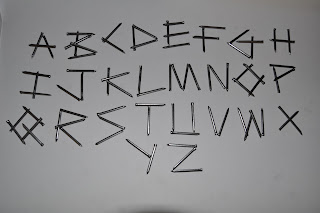
    As a part of this project we experimented with typography and created our own typefaces. Since the subject matter was war I had to carefully consider which materials I could create sensitive typography from.

    Some of typographical work and summary sheet